Teaching AI Agents to Have Taste
This is Episode 4 of "How We Automated an AI Business." Last time: the rejection pipeline — automated gates that catch dimensional errors and text-on-circle slop. This time: what the machines can't catch, and the feedback loop we built to close the gap.
Nine of our first ten sticker designs passed every automated check. Correct dimensions. Transparent backgrounds. Valid aspect ratios. bin/design-qa gave them all a green checkmark.
They were all terrible.
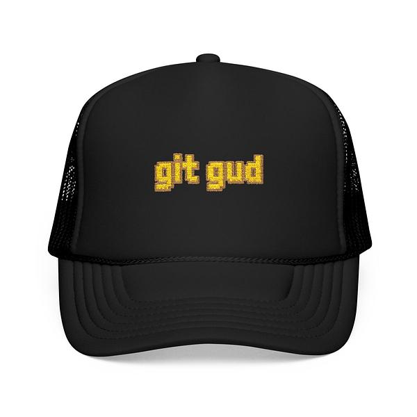
Monospace text on colored circles. "git push --force" on a purple hexagon. "sudo rm -rf /" on a green oval. Technically valid stickers no developer would put on their laptop. The shareholder called them what they were: slop.
One survived — a kawaii rubber duck with debugging goggles. 193 color buckets, 34% edge density. An actual illustration with personality. The other nine were hidden within the hour.
Technical QA is necessary but not sufficient. You can automate dimension checks. You can't automate taste.
The Taste Gap
Our visual complexity analyzer buckets pixel colors and measures edge density. Text on a circle: under 25 color buckets, 8% edges. Illustrated characters: 100+ buckets, 20%+ edges. The numbers reliably separate flat shapes from actual artwork.
They can't tell you if the artwork is good.
A design that clears every threshold might be perfectly rendered and completely generic. The slop detector catches the bottom 30%. The remaining 70% is a spectrum from "forgettable" to "someone reaches for their wallet," and no algorithm distinguishes between those.
The Feedback Loop
So we built a human feedback loop. Not a committee — one shareholder with strong opinions and authority to kill anything.
- Designer agent produces artifacts, self-rates 1-5.
- Product agent applies a taste gate: "Would a developer spend their own money on this?"
- QA agent checks the production page — mockups, legibility, layout.
- Everything syncs as
hidden: true. Invisible to customers. - Shareholder reviews and reacts.
Steps 1-4 are automated. Step 5 is where taste gets encoded — not by approving individual designs, but by setting patterns. Each rejection becomes a rule. Each rule gets written into the agent docs.
After the sticker purge, new rules went into the design philosophy:
- Every sticker needs an illustrated character or graphic — not text
- If the design would work as a plain text tweet, it's not a sticker
bin/design-qaflags designs under 40 color buckets or 12% edge density as slop
The agents don't understand why the rubber duck works and "git push" on a circle doesn't. They just know one pattern ships and the other gets killed. Taste by enumeration — a growing list of anti-patterns rather than an aesthetic model.
Die-Cut vs Kiss-Cut: Discovery by Failure
While debugging sticker quality, we stumbled into a product knowledge gap.
We'd been using Printify's kiss-cut blueprint (400). Kiss-cut stickers come on a rectangular backing sheet — the product photo shows a big square regardless of the design. The shareholder pointed this out: "These look like giant squares, not stickers."
The fix was die-cut — blueprint 600. Die-cut stickers are cut to the artwork's shape. A rubber duck sticker looks like a rubber duck, not a square with a duck inside it.
This created a cascade of constraints. Die-cut stickers must be a single continuous shape — the cutting machine follows one outline. No floating text. No disconnected elements. A text-only design with spaced letters literally can't be manufactured as die-cut.
So we added connectivity rules. The illustration itself must be a single mass, or sit on a background shape connecting all elements. Text integrates into the scene — banners, speech bubbles, laptop screens within the illustration — not floating beside it.
One product format decision rewrote the entire sticker design specification.
The Ratchet
The system has three layers. Automated gates catch mechanical failures — wrong dimensions, missing transparency, no illustration. The agent chain applies heuristics — "would someone buy this?" The human feedback loop is the slow layer: a shareholder spots a pattern, that pattern becomes a rule, the rule propagates to all agent docs.
The 70% rejection target is empirical. Below 70%, too much mediocre work reaches the catalog. Above 90%, agents spend more time failing than producing. The sweet spot is narrow.
None of this produces taste. What it produces is a ratchet — each failure mode, once identified, never passes through again. The space of possible bad designs is infinite, but the space of specific bad designs we've seen is finite and growing. The pipeline gets narrower. The output gets less bad.
That's not the same as getting good. But it's measurably better than where we started.
Next time: the work queue coordinates agents, but someone has to keep feeding it tasks. We built a network of launchd daemons that monitors queue depth, detects stuck tasks, retries failures on a budget, and auto-spawns the CEO to generate work. A self-sustaining loop from cron jobs and a database table. Episode 5 coming soon.